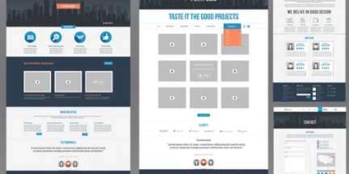
Have you ever gotten lost on a website, clicking through endless menus and pages with no clear direction? Confusing website navigation can leave users frustrated and abandon their visit altogether.
Have you ever gotten lost on a website, clicking through endless menus and pages with no clear direction? Confusing website navigation can leave users frustrated and abandon their visit altogether. This is where well-planned website navigation comes in – it acts as the roadmap, guiding visitors through your website and ensuring a smooth and enjoyable online journey.
Imagine your website as a well-organized store. Products are clearly categorized, shelves are neatly labeled, and there's a helpful map to guide you. This is what effective website navigation strives for. It provides visitors with a clear understanding of the website's structure and allows them to find the information they need quickly and effortlessly.
So, what are the key ingredients for user-friendly website navigation?
Simplicity is Key
Avoid overwhelming users with complex menus or excessive information. A website designer should prioritize a clean and simple layout, using clear labels and intuitive menus with a limited number of options.
Logical Organization
Structure your website's content in a way that makes sense. Group related pages together under clear categories. This logical organization allows users to browse intuitively and anticipate where to find the information they seek.
Breadcrumbs Leave a Trail
Imagine breadcrumbs like little markers sprinkled throughout your website. They indicate the user's current location within the website's hierarchy, allowing them to easily navigate back to previous sections. Breadcrumbs provide a sense of direction and ensure users don't feel lost in the maze of webpages.
Search Functionality Matters
Not everyone enjoys browsing menus. A well-functioning search bar empowers users to find specific information quickly and efficiently.
A skilled website designer can incorporate these elements seamlessly to create an intuitive website navigation system. Here's how they can further enhance the user experience:
Visual Cues for Clarity
Don't underestimate the power of visual elements. Website designers can use icons, hover effects, and color variations to guide users and highlight important sections. Visual cues can make navigation more intuitive and engaging.
Mobile-Friendly Design
In today's mobile-first world, ensuring your website navigation is optimized for smaller screens is crucial. A website designer can implement responsive design principles to ensure menus and buttons are easily accessible and user-friendly on all devices.
Accessibility for All
Website navigation should be inclusive and accessible to everyone. Website designers should consider incorporating features like keyboard navigation and screen reader compatibility to ensure a smooth experience for users with disabilities.
By prioritizing user-friendly website navigation, a
website designer can transform your website into a welcoming and efficient platform. Remember, a well-structured website keeps users engaged, encourages exploration, and ultimately, helps you achieve your online goals.
So, don't let confusing navigation become a roadblock for your website's success. Invest in clear, user-friendly navigation, and watch your website become a hub for a positive and productive online experience.
 Бесплатные Дорамы на Русском: Онлайн-Трансляция для Всех Поклонников Азиатской Культуры
By worksale
 Make love and feature genuine satisfaction with elegant Udaipur call ladies
By vicky9680
 Купить диплом: ваша дверь к возможностям и профессиональному росту!
By worksale
 Epic Escapade: Crafting All-Age Joy with the Video Symphony
By worksale
 Образование без границ: Купи диплом и достигни своих целей
By worksale


